
We Care for Paws Foundation
UX Architecture & Adoption Funnel Redesign
Improving adoption conversion, navigation clarity, and donor trust through structured information architecture and mobile-first design.
This project focused on transforming a cluttered nonprofit website into a streamlined, user-centered experience that prioritizes adoption, simplifies donations, and reinforces organizational credibility.
The Challenge

The existing website lacked visual hierarchy, structural clarity, and clear task pathways. Critical user actions such as adopting a pet, donating, or contacting the organization were fragmented across pages and buried within dense content blocks.
Key Issues Identified:
• Disorganized navigation structure
• Excessive information density
• Multiple redundant donation entry points
• Confusing adoption workflow
• Inconsistent placement of contact information
• Weak mobile optimization
• Low visual credibility and trust
Primary Risk:
Users encountering friction during the adoption process may abandon the journey before completing an application.
DISCOVERY & RESEARCH
To understand where breakdowns were occurring, I conducted a structured content and usability audit.
Methods Used:
• Full content inventory and categorization
• Card sorting to identify logical groupings
• Empathy mapping to capture adopter motivations
• Priority matrix to isolate high-impact issues
• Task-flow analysis of the adoption and donation journeys
User Insights:
Prospective adopters prioritize clarity, trust, and simplicity.
Users expressed a need for:
• Clear, concise information
• Easy access to adoptable animals
• A straightforward adoption process
• Transparent contact details
• A visually trustworthy interface
Pain Points Identified:
• “Too much information”
• “The site feels under construction”
• Difficulty locating social links
• Confusing navigation
Behavior Patterns:
• Users look for animal photos first
• They search for adoption requirements
• They evaluate visual credibility before donating
• They want quick access to contact forms

Describe your image

Describe your image

Describe your image
STRATEGIC UX FRAMEWORk
To resolve structural and usability issues, I applied a four-phase intervention model.

Audit
Architect
Simplify
Convert
Evaluated content redundancy, donation friction, visual hierarchy gaps, and navigation overload.
Designed a simplified sitemap and reorganized content according to primary user goals.
Reduced cognitive load by increasing spacing, scaling typography, and removing unnecessary duplication.
Created a structured adoption funnel and centralized donation system to support task completion.
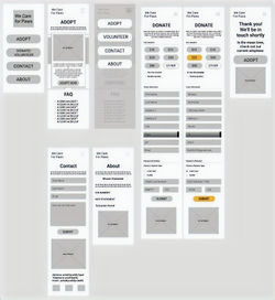
INFORMATION ARCHITECTURE
The redesigned structure aligns with primary user intent: adopt first, support second, explore third.
Primary Navigation:
Home
Adopt
Donate / Volunteer
Contact
About
Footer:
Email
Address
Social Media Links
Donate
Before
• Donation links scattered across multiple pages
• Volunteer and adoption content mixed together
• Contact information duplicated in several sections
After
• Centralized donation entry point
• Clearly structured adoption pathway
• Separation of mission details from task-based actions
• Improved footer utility navigation
 |  |  |
|---|---|---|
 |  |  |
The updated architecture supports faster decision-making and reduces task friction.
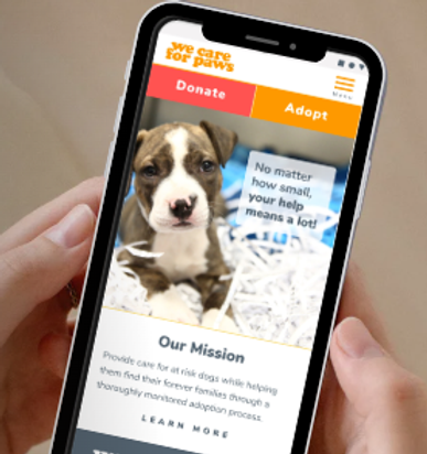
UI REDESIGN
The interface redesign focused on visual clarity, mobile responsiveness, and emotional trust.
Streamlined Adoption
Experience
• Structured pet profiles with consistent layout
• Prominent “Apply to Adopt” CTA
• Clear steps for adoption requirements
Donation
Functionality
• Preset donation amounts to reduce friction
• PayPal integration for secure processing
• High-visibility donation CTA in navigation and footer
Navigation &
Visual Design Improvements
• Clean mobile navigation system
• Increased typography scale for readability
• Bright, inviting color palette
• Reduced text density
• Improved spacing and alignment
The updated interface supports intuitive navigation while reinforcing nonprofit credibility.
BEFORE & AFTER
The redesign demonstrates how strategic structure directly impacts clarity, trust, and conversion potential.
Before:
• Dense layout
• Brown-heavy color scheme
• Fragmented donation options
• Poor content grouping
• Low visual trust
-
Computer only option


After
• Structured layout with clear hierarchy
• Consolidated donation pathway
• Adoption-first navigation strategy
• Simplified user journey
• Modern, trustworthy aesthetic


EXPECTED IMPACT & Reflection
By aligning structure with user goals, the website becomes a tool for both emotional connection and task completion.
This UX intervention is projected to:
• Reduce cognitive overload
• Increase adoption pathway clarity
• Improve donation trust perception
• Strengthen mobile usability
• Reinforce organizational credibility